Case Study – Responsive Website UX Design
ABC Safaris Responsive Website UX Design
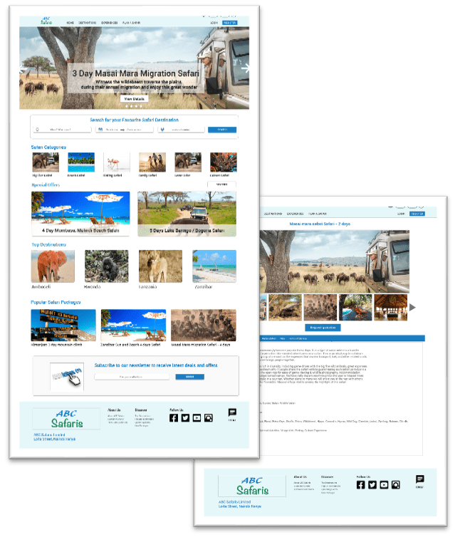
Duration: October 2022 – December 2022
The Product
ABC Safaris is a travel agency that is focused on offering safari vacation packages to its clients. They are looking to expand their market reach by an interactive easy to use website. The website enables travellers to explore safari destinations, request personalised quotations, easily communicate with a travel expert and make reservations. The website not only will expand customer base but also improve shopping experience of existing customers
The Problem
People who have a busy career don’t spend enough time with their loved ones and cannot find time to plan for a safari vacation
The Goal
Design a website that will enable users plan their dream safari using a travel agent. The website will enable them to explore a vast range of potential safari destinations and experiences, get tailor made quotations, and complete the safari reservation
My Role
UX designer responsible for designing the ABC Safari travel website from conception to delivery of the final prototype
My Responsibilities
Conducted foundational research, developed paper wireframes and digital wireframes, low and high-fidelity prototypes Conducted usability studies, which accounted for accessibility and iterated on designs.
Understanding the User
User Research
I conducted user research to understand user goals and motivations, fears and challenges when planning for a safari vacation using a travel agent
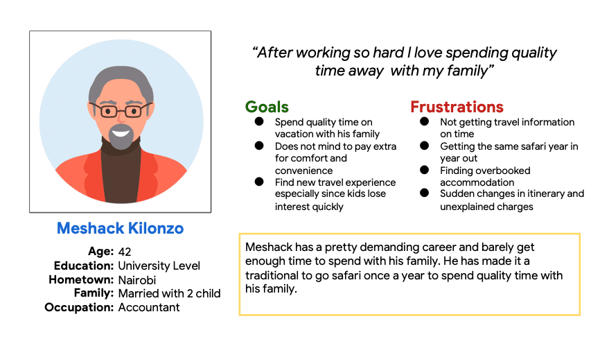
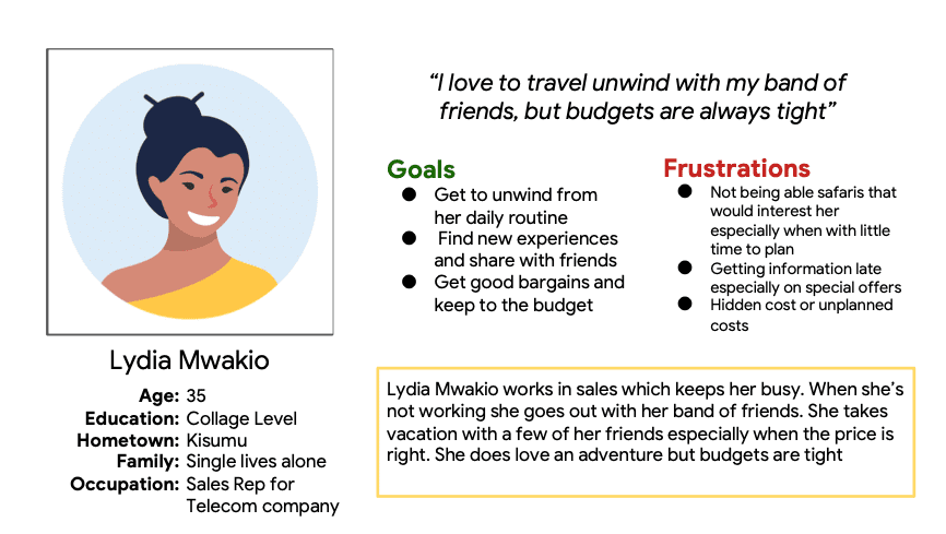
Interviews were conducted on a target group mainly who have taken a vacation in the past two years with or without a travel agent. The results of the interviews formed a primary user group represented by a persona I named Meshack and a secondary user group represented by a persona Lydia
Pain Points
Lack of Information
Not having a variety of options when shopping for safaris. Users cannot easily find safaris destinations that are interesting to them
Timeliness
Not getting timely information while planning the trip and later when there are changes in itinerary
Hidden Cost
Hidden costs or unplanned extra costs
Persona 1: Meshack
Problem Statement
Meshack is a busy career accountant who needs plan a new and exciting safari because he wants to spend quality time with his family
Persona 2: Lydia
Problem Statement
Lydia is a single, easy outgoing sales rep who needs a quick getaway at a discounted price because she would like to relax and unwind with her friends
Sitemap and Paper Wireframes
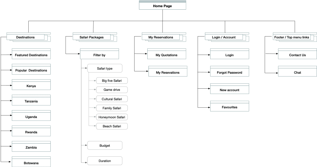
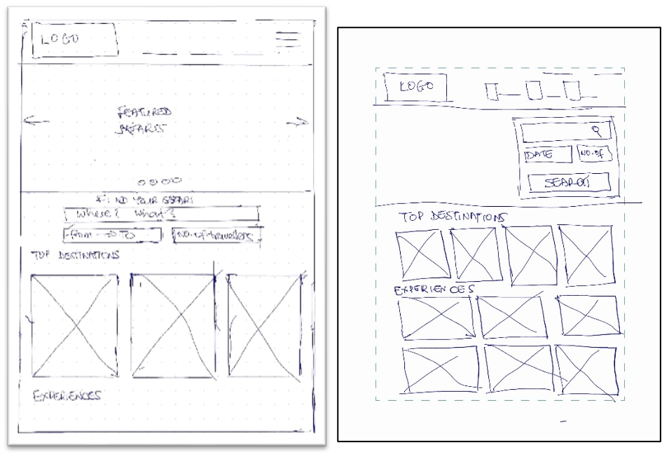
Focusing on the goal of enabling users to easily find safari experiences, I came up with a sitemap that enables users easily find new safari experiences
Digital Wireframes and Low Fidelity Prototype
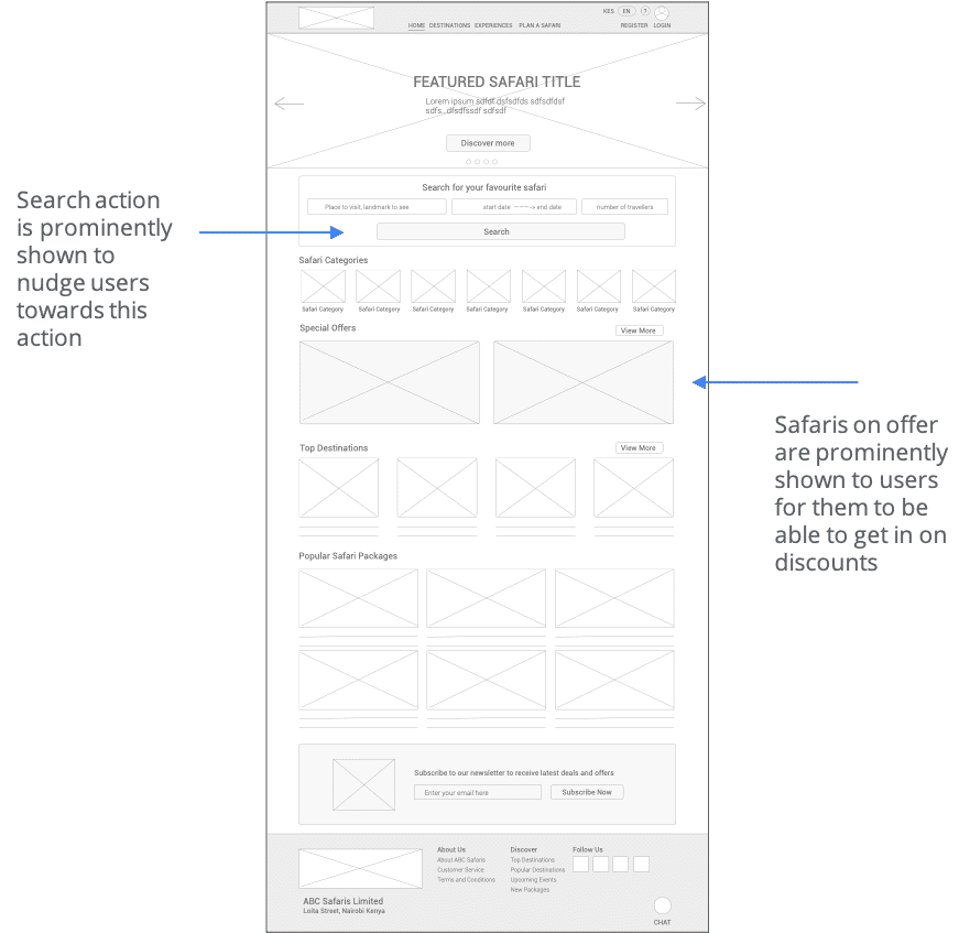
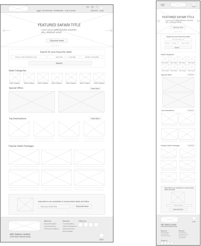
Moving from paper wireframes to digital wireframes, the website allows users to explore safari destinations and get personalized quotations
Low Fidelity Prototype
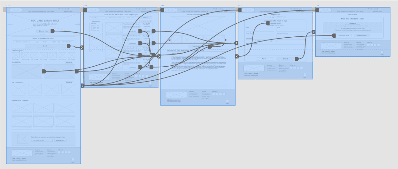
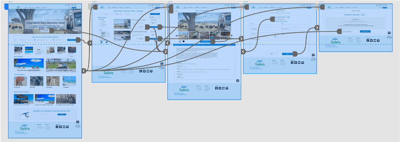
Using digital wireframes, I created a low-fi prototype to highlight the main user flow. This was used for first usability test
Usability Study Findings
I conducted two rounds of usability studies. First on the low-fi prototype with the second one on the hi-fi prototype. The insights developed were used to iterate on the designs and improved on the usability of the overall app
Round 1 Findings
1
Search
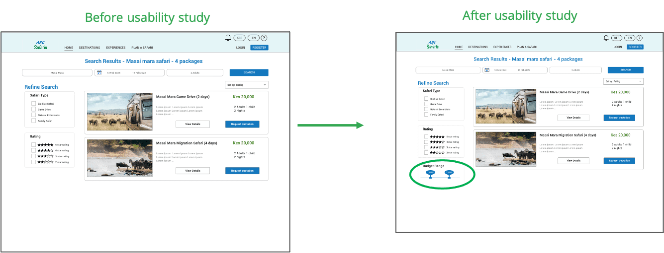
Users want the ability to filter search results by budget range
2
Rating
Users want to view feedback other customers gave on safari destinations/ packages
3
Share / Save Options
Users want to be able to save destinations to a wish list and be able to easily share with other people
4
External Assistance
Its not clear to the users how to get assistance from a travel consultant. The chat feature is hidden at the bottom
Mockups and High Fidelity Prototype
According to the insight that users want the ability to filter search results by budget range, I added a range slider to the search results page

High Fidelity Prototype
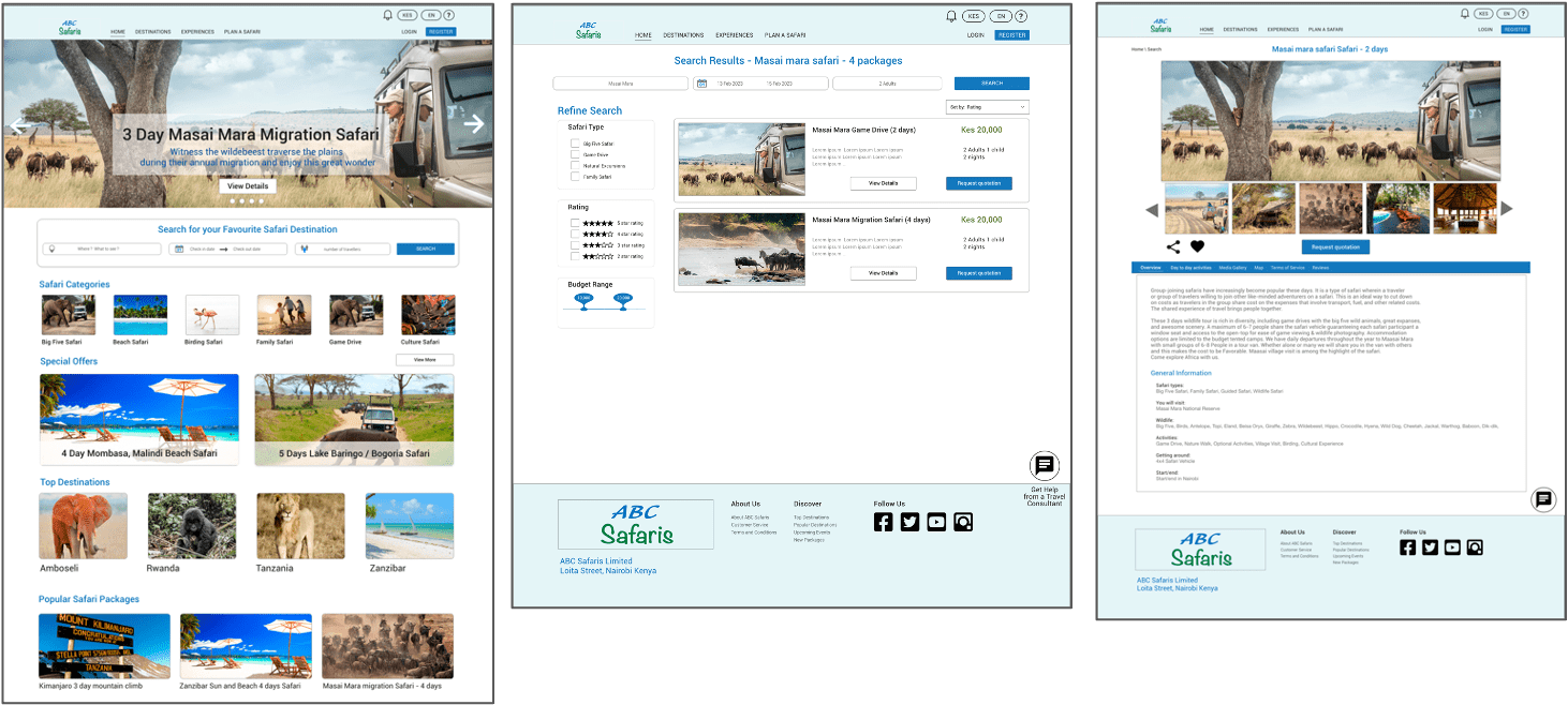
High-fidelity prototype after design iteration following the usability study
Accessibility Considerations
Responsive website designs for mobile, tablet and desktop screen sizes
The typography is organized in headings of different sizes to create a visual hierarchy which makes it easy for visually impaired people to read and for screen reader access
The chat app includes a voice function to aid people with mobility functions
Images used throughout the app have alt-text to ensure screen readers work properly
Takeaways
Impact
Usability study participants found the website design easy to use. A majority of them found it would go a long way making it easier for them to find new safari ideas and explore destinations with ease
What I learned
I’ve learned that while you iterate through your designs, design decisions need to be backed by data coming from the feedback of users. This is what putting the users front and centre of all design decisions means
